CREDIT CARD MANAGEMENT

CREDIT CARD

MANAGEMENT

CREDIT CARD MANAGEMENT

CREDIT CARD MANAGEMENT

focus area

UI/UX DESIGN
PRODUCT STRATEGY
PRODUCT DESIGN

TEAM

siddharth

NANDINI GANGAL

HAREESH TR

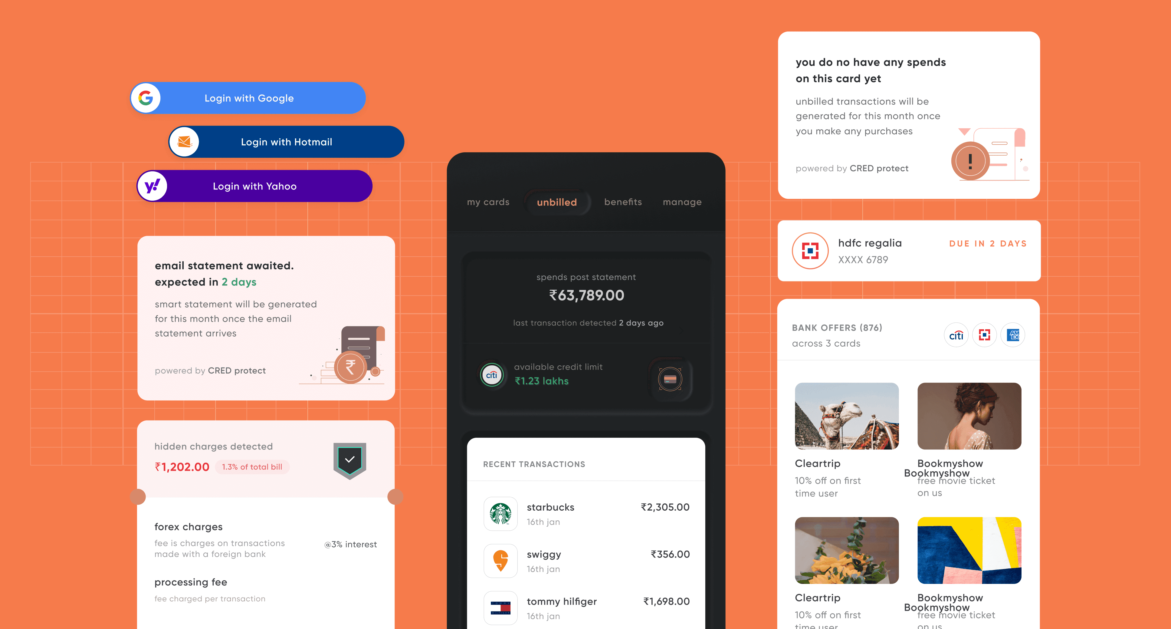
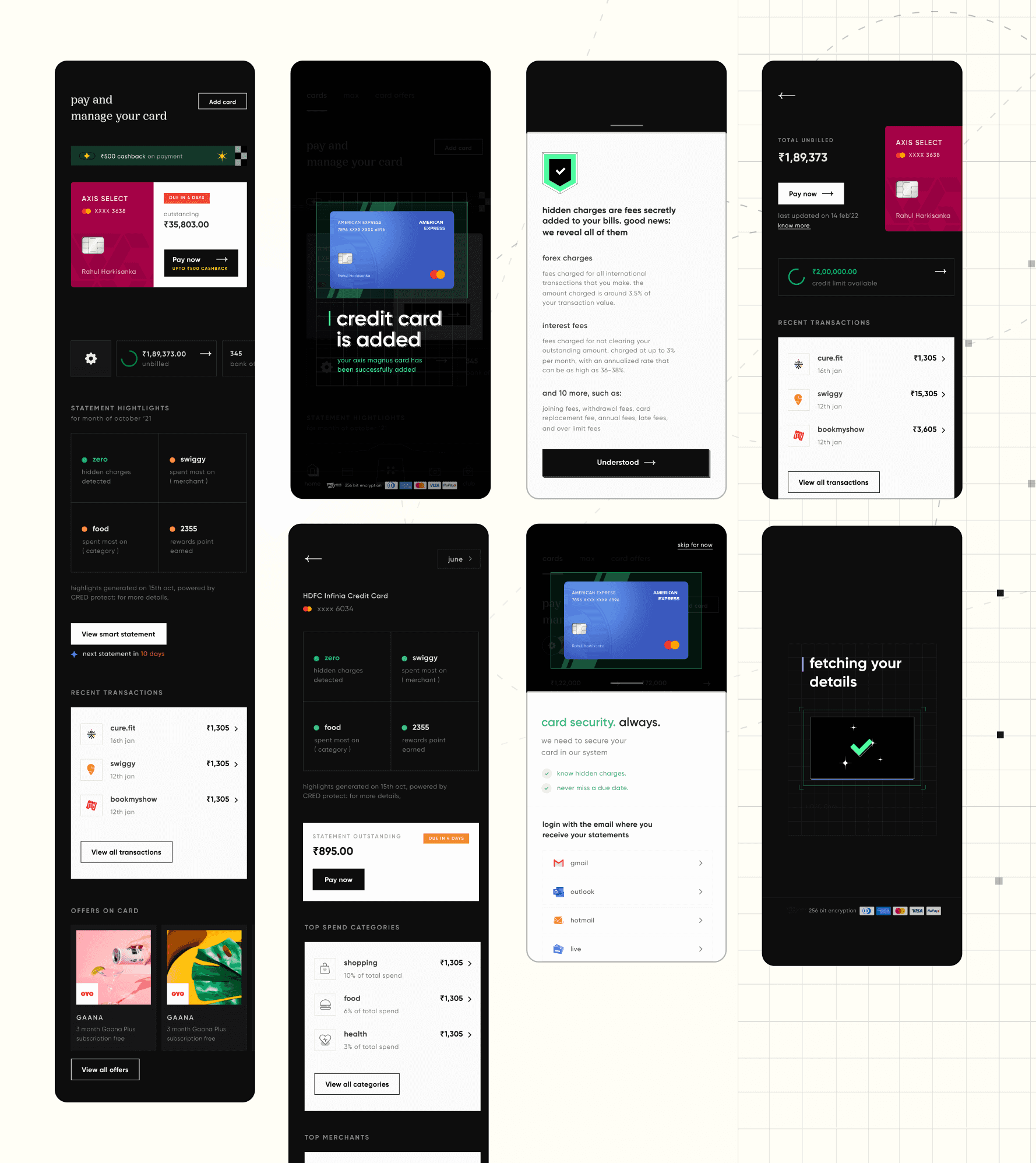
Cred's Credit Card Management system offers a streamlined approach to handling credit card payments and transactions. It provides a comprehensive overview of credit usage while promoting transparency around hidden charges. Key features include smart statements that break down expenses intelligently, curated bank offers tailored to the user, and a seamless process for claiming contextual rewards.

ILLUSTRATION

JIBIN JOSEPH

SIDDHIKA DESHMUKH

ABHISHEK BALAN

MOTION DESIGN

JIBIN JOSEPH MITHUN MOHAN SARATH CHANDRAN

DEVELOPERS

ARAVIND Raj

kaustav

NIKUNJ SHARMA

MY ROLE IN THIS PROJECT

MY ROLE IN THIS PROJECT

MY ROLE IN THIS PROJECT

MY ROLE IN THIS PROJECT

Joining CRED as an intern on the Card Management team in 2020, I rapidly progressed to co-lead the team by 2023. 


During this period of accelerated growth, I spearheaded two complete overhauls of the card management system to keep up with the scale of the company. These enhancements weren't just about updating screen designs—they were driven by extensive experimentation, ongoing analysis, and a deep understanding of business needs.

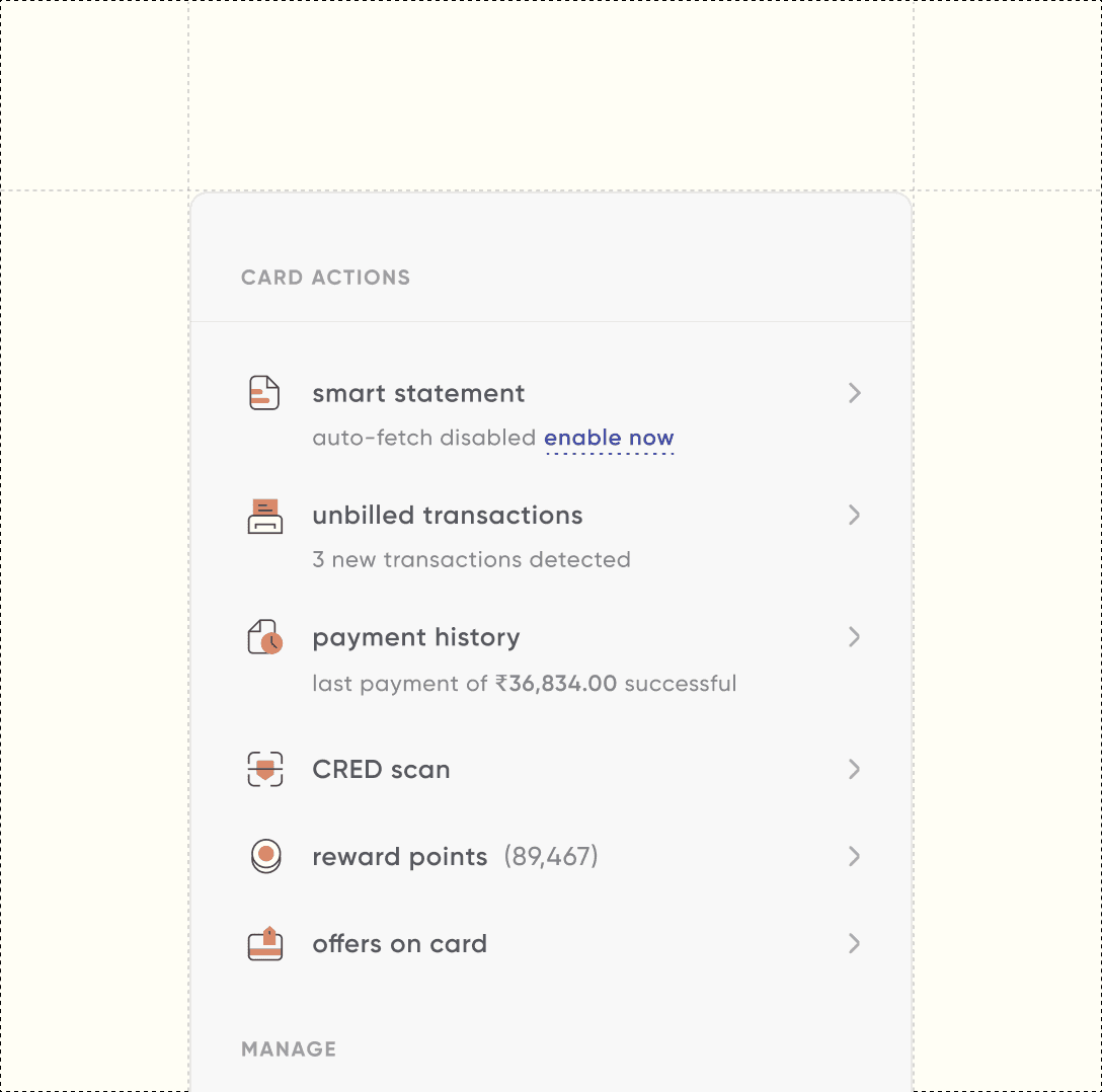
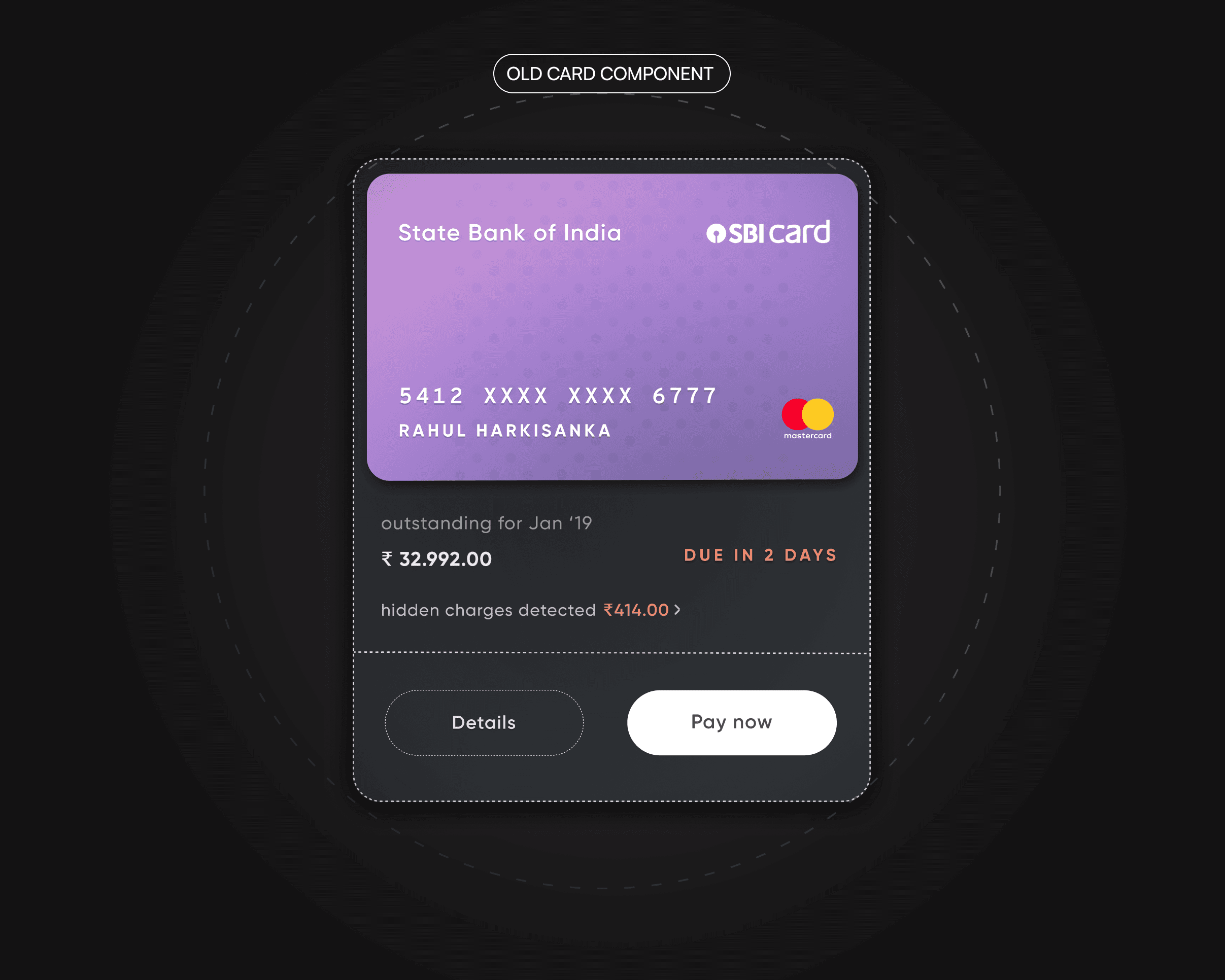
The initial card management system consisted of two core screens: Card Ledger and Card Details. At that early stage, our technology and feature set were minimalistic, offering only essential functionalities.

NEOMORPHISM

NEOMORPHISM

NEOMORPHISM

NEOMORPHISM

NEOMORPHISM

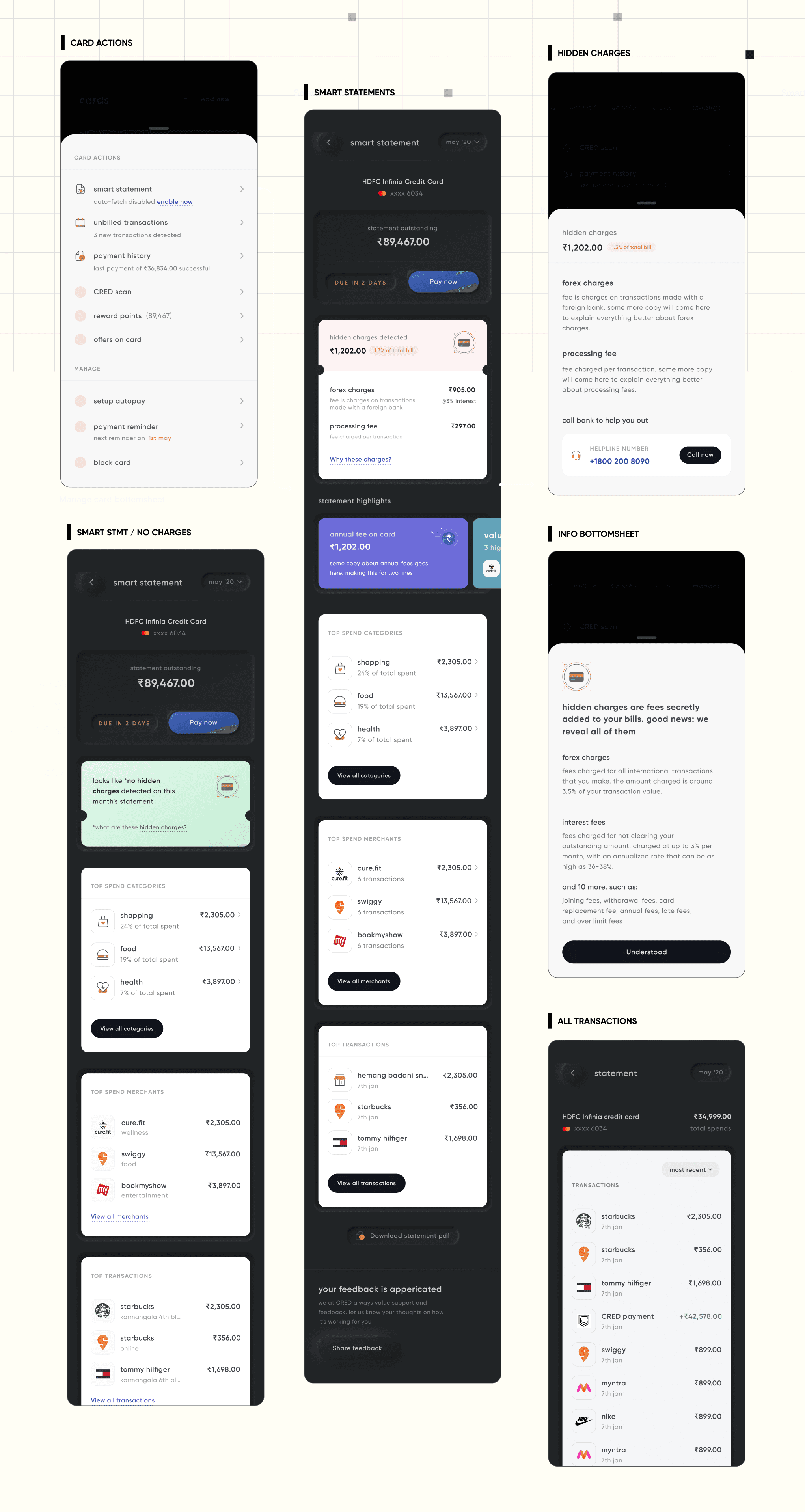
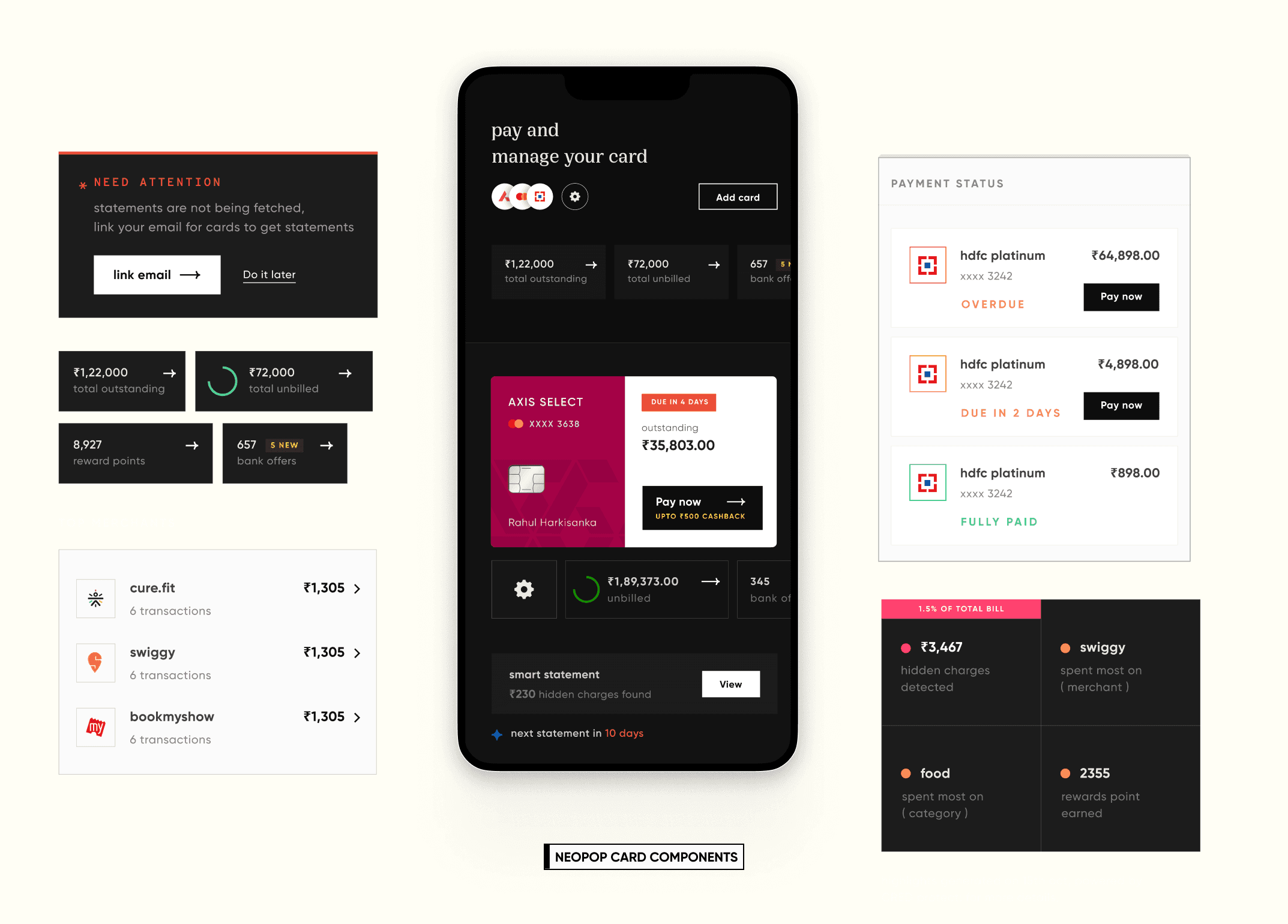
The majority of 2020-’21 was spent adding & scaling management features like Un-billed Tracking, Bank Rewards Discovery and Smart Statements. 

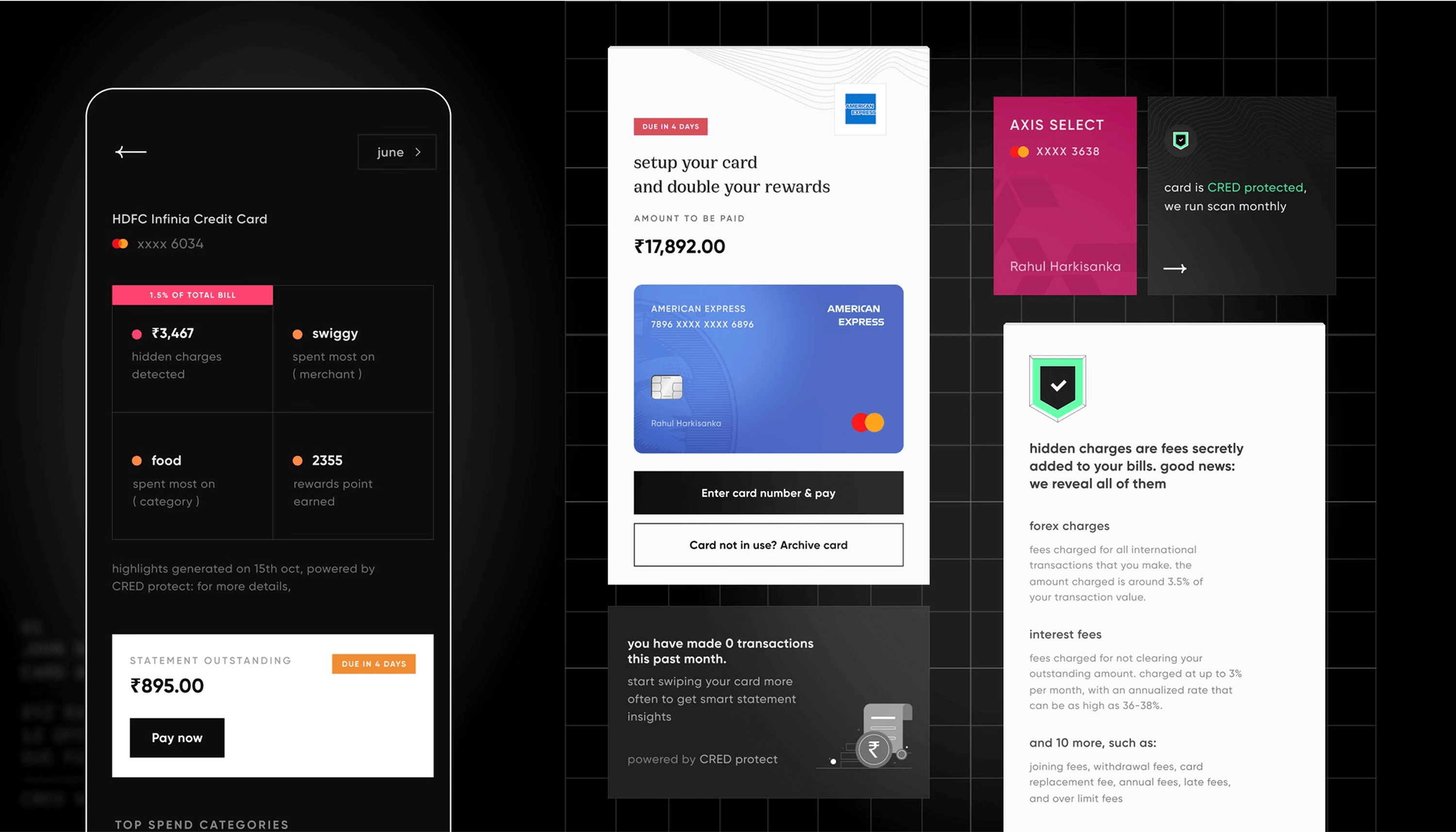
We as a team also doubled down on our value prop of providing complete transparency and visibility of hidden charges.

With better tagging and categorisation we could deliver better insights to the member and hence came, Smart Statements. Providing an easy to comprehend your credit card behavior with additional context wherever needed.

Better tagging and explicit data surfacing worked wonders for us. It validated a lot of initial gut calls and gave us a huge boost metric wise. It also exposed even more pain points that a member faces while managing their credit card which in turn helped make out systems robust.

BUSINESS CONTEXT

In 2021, CRED experienced significant growth and spent a considerable amount of time determining what works for our members and what doesn't. The subsequent iteration of card management required a multi-layered UX design approach. We as a company aimed to enhance the card business but also to facilitate cross-selling other company services.


In 2022, we revamped our design and brand style while implementing planned enhancements to the cards screen. These changes aimed to improve user experience and increase scalability for the company.

In addition to rethinking the Cards screen, we faced the substantial task of reskinning all the screens that we had currently live in the app.

DESIGN PRINCIPLE

DESIGN PRINCIPLE

DESIGN PRINCIPLE

DESIGN PRINCIPLE

DESIGN PRINCIPLE

DESIGN PRINCIPLE

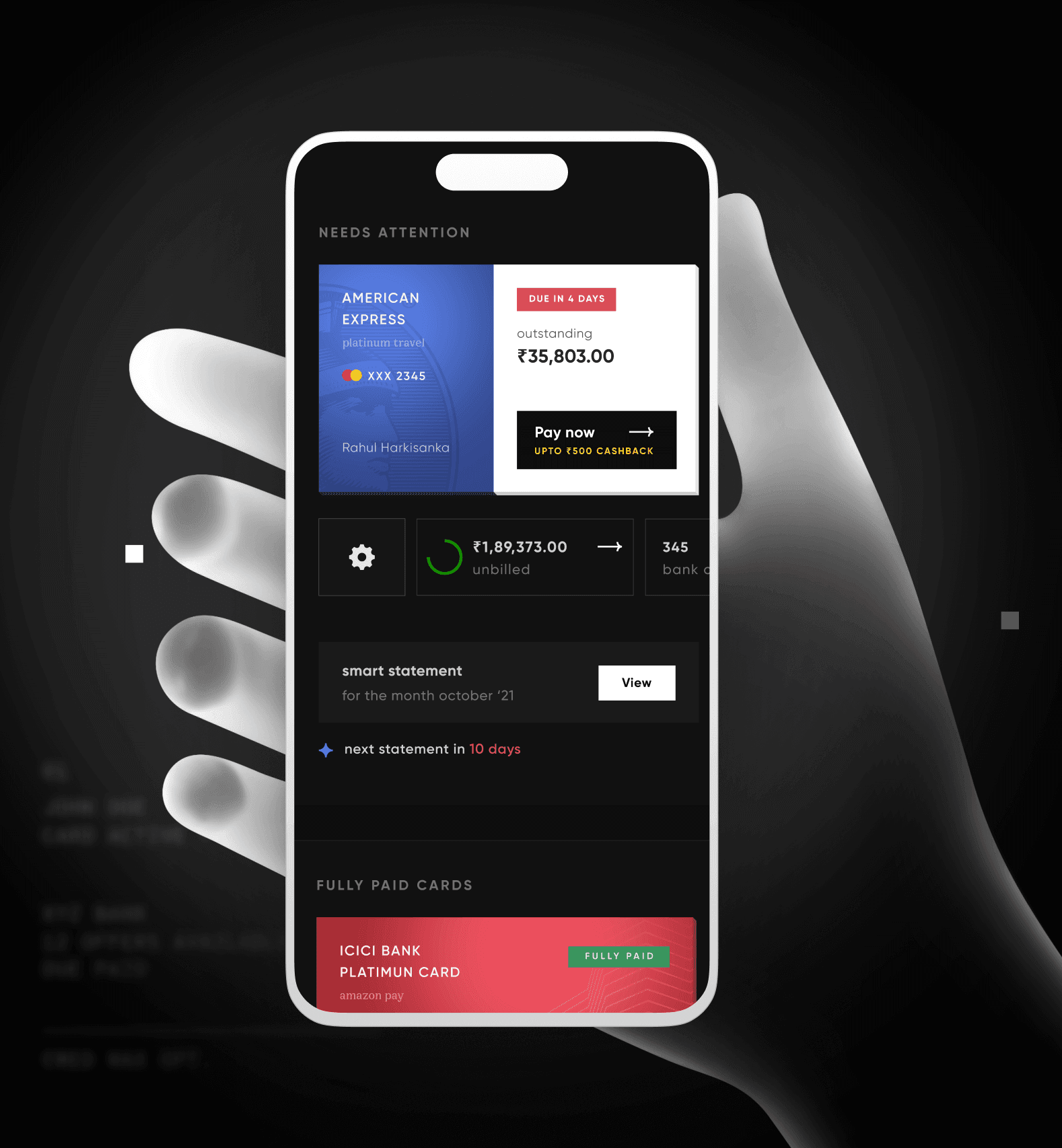
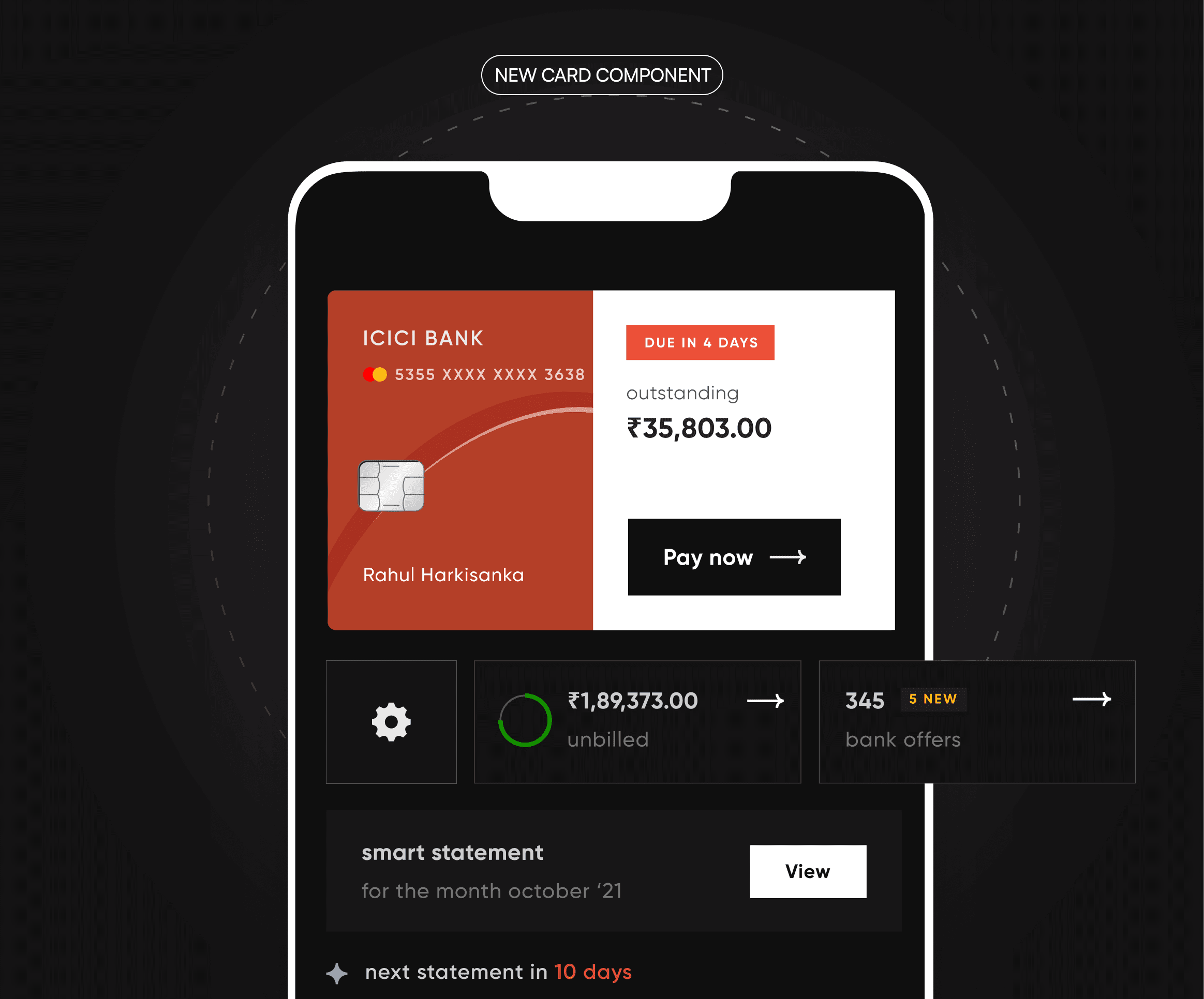
We enhanced the card management interface to be dynamic, emphasizing the delivery of essential information at the appropriate times, rather than overwhelming users with all data simultaneously. 

Necessary  information was made readily accessible at the user's fingertips and integrated directly into the card view. This also helped us to give a more holistic and personalized management experience to the user.

We enhanced the card management interface to be dynamic, emphasizing the delivery of essential information at the appropriate times, rather than overwhelming users with all data simultaneously. 


Necessary  information was made readily accessible at the user's fingertips and integrated directly into the card view. This also helped us to give a more holistic and personalised management experience to the user.

DRAG

DRAG

DRAG

By surfacing all relevant information in the context of the card, we eliminated the previous tab structure, significantly simplifying navigation for our users.

CARD DESIGN

CARD DESIGN

CARD DESIGN

CARD DESIGN

CARD DESIGN

CARD DESIGN

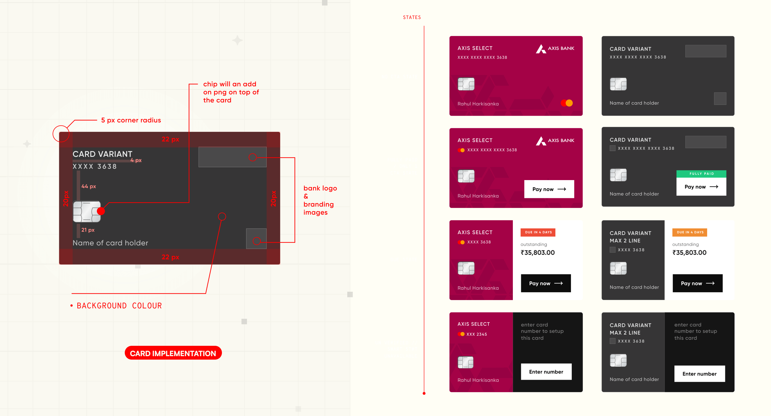
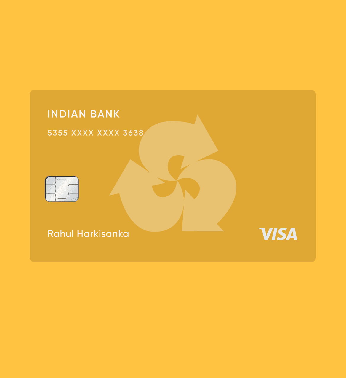
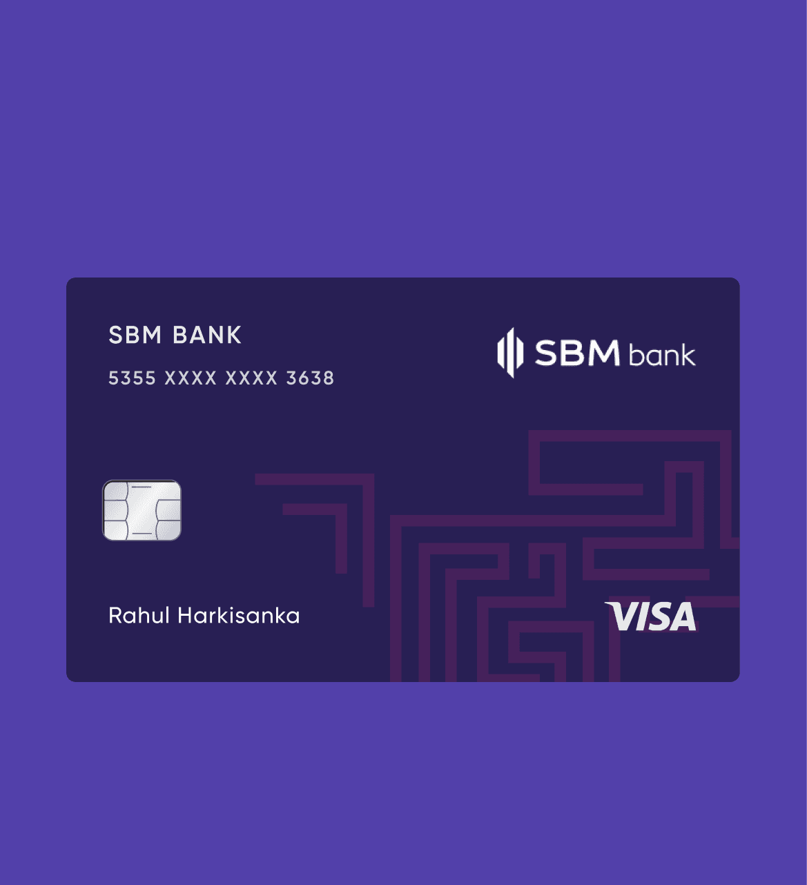
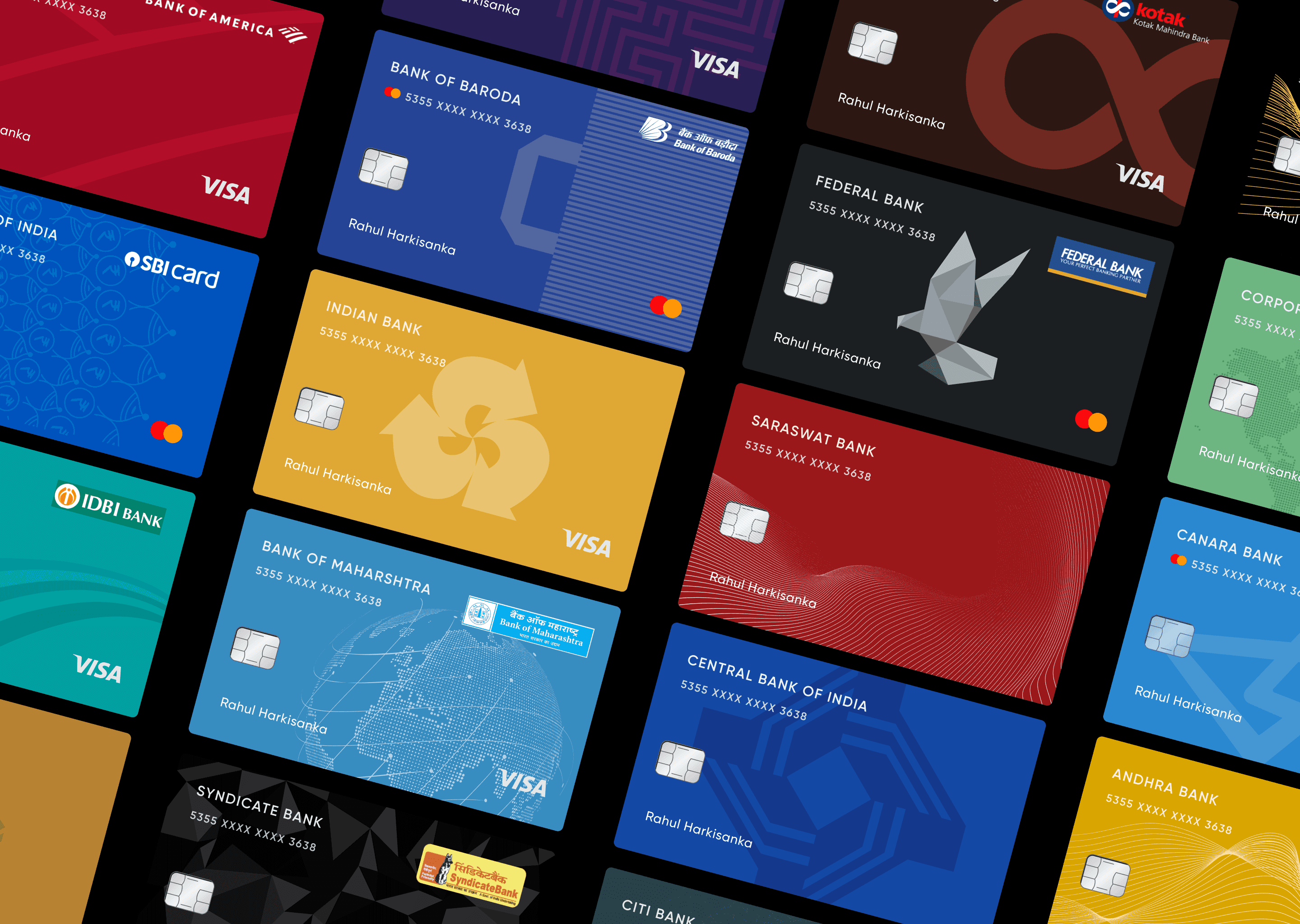
The credit card design goes beyond aesthetic appeal.  

It incorporated dynamic elements that effectively surfaced  information when needed.  This was accomplished by a constructive collaboration with design and various tech teams to ensure visual finesse with compromising on functionality.

All individual card art created by the amazing Siddhika Deshmukh.

DESIGN CHANGES

DESIGN CHANGES

DESIGN CHANGES

DESIGN CHANGES

DESIGN CHANGES

DESIGN CHANGES

In conjunction with these changes, I integrated contextual cross-sell components, including reward claims, bill payments, and the presentation of bank offers. 

We also enhanced our smart statements by displaying information more prominently, leveraging our improved technology stack's capabilities in identifying and tagging transactions.

CLOSING THOUGHTS

Card management, a vital CRED component, saw my growth from intern to co-lead - an immensely rewarding journey. I'm grateful for the invaluable lessons in systems thinking and the early opportunity to build an efficiently functioning POD. 


All credits to my lovable and amazing manager at the time Nandini Gangal, who mentored through these years and helped me compound.

Being the most important CRED pillar, the journey from being an intern to co-leading this was incredibly rewarding. I am personally very grateful as I learned a lot of systems thinking and got a chance really early in my career to build a team to efficiently function as a POD.

Credits to Nandini Gangal for being the best manager, an rookie designer like me could have.