ILLUSTRATION & MOTION
Jibin Joseph
Siddhika Deshmukh
Abhishek Balan
Midhun Mohan
Sarath Chandran
product design
Me
Nandini Gangal
DEVELOPERS
Nikunj Sharma
Prateek Srivastava

/ The Challenge
CRED's brand emphasis on design and innovation had already created organic word-of-mouth growth. The team needed to systematize this process with a simple yet effective referral framework that would accelerate acquisition while maintaining the premium brand experience for both existing and new members. This delicate balance required a referral system that felt like a natural extension of the app rather than a bolted-on growth hack.
/ our approach
Simple value exchange
The approach focused on adopting a simple initial referral framework: "Invite a friend + Friend signs up + Both parties receive a reward." These rewards could range from cashback to coupons to campaign prizes, creating immediate value for participation.
The design and development implementations aimed to scale the Referral into a comprehensive platform that could grow with the business while maintaining the premium experience that CRED members expected

Solution: Reducing Friction
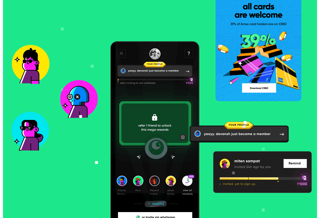
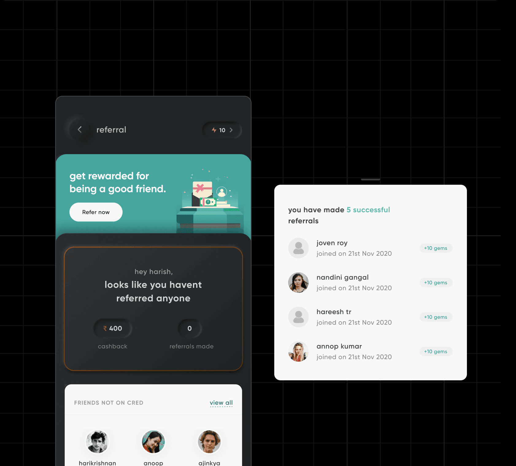
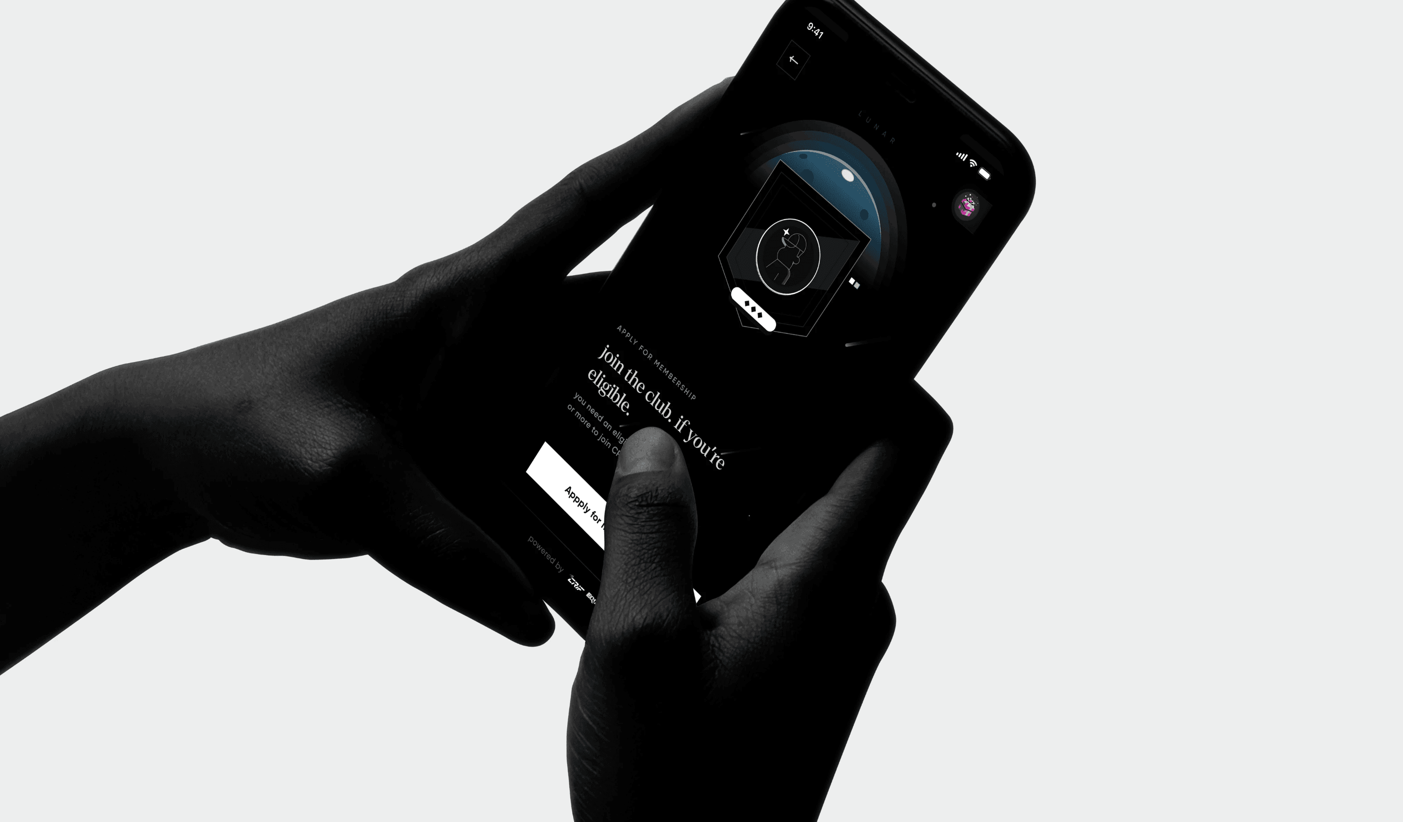
version I : the beginning
The first revamp had a crystal clear objective: reduce friction between the in-app referral trigger and user action. Key improvements included:
A modular screen layout presenting more information upfront, improving comprehension and interaction
Transitioning from the gems framework to streamlined communication, making it more direct
Integrating referral options earlier in the rewards pages for better visibility
The referral screen was designed with flexibility, enabling A/B testing on widgets directly from the backend without app updates. This approach allowed easy configuration of elements like order and visibility, optimizing user experience in real-time.
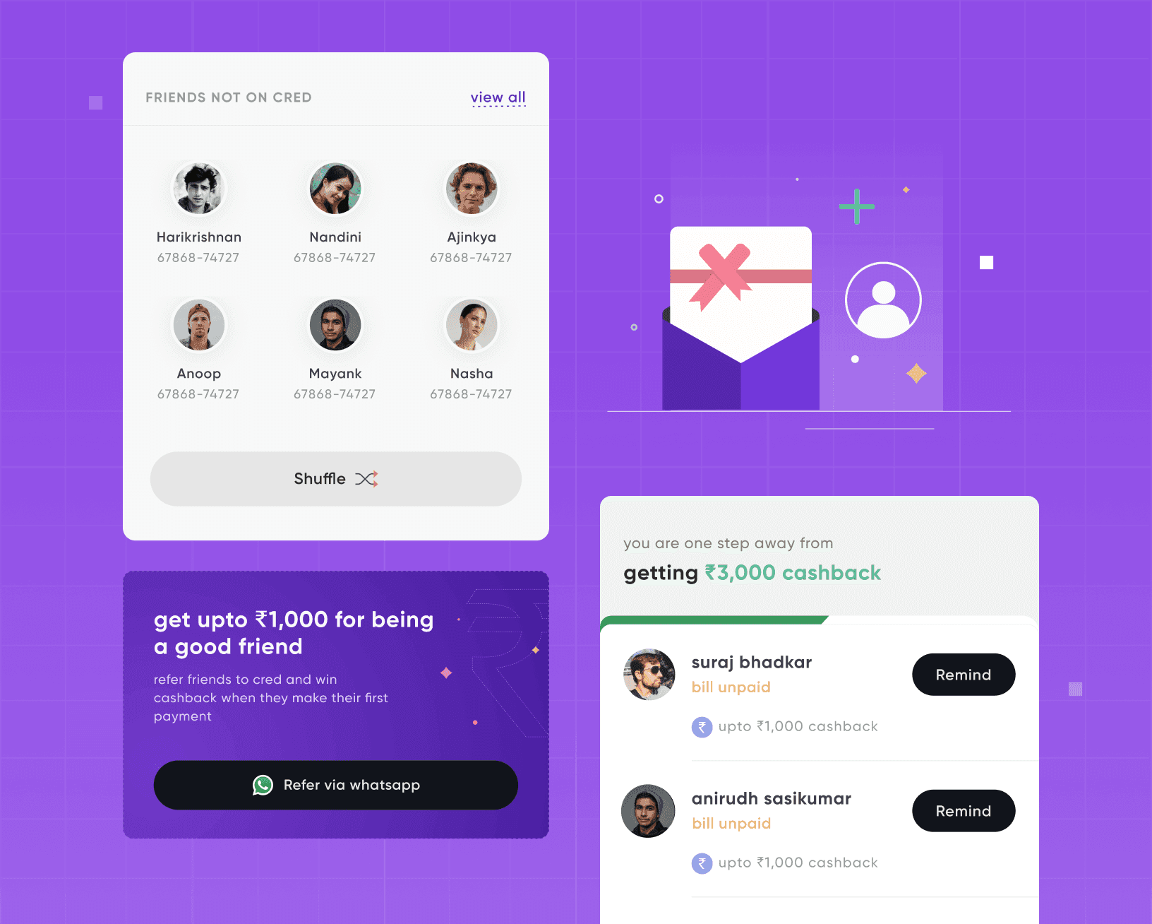
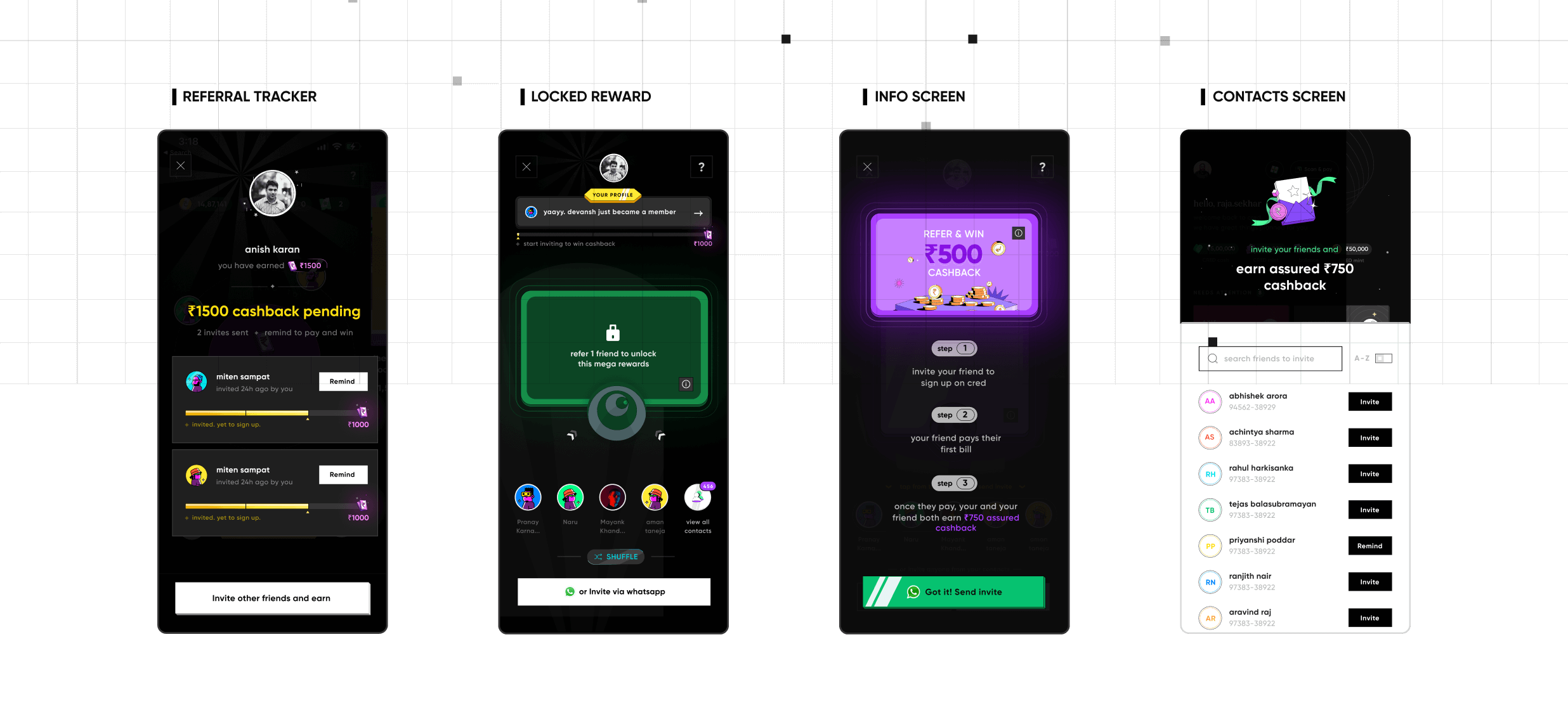
Solution: Dedicated Dashboard
Tracking growth in one place
A significant new feature introduced was the Referral Dashboard, offering users a dedicated space to track and initiate referrals. This feature enabled users to monitor pending referrals, explore referral-exclusive rewards, and initiate new referrals all in one place.
New components and widgets were tailored to minimize the gap between referral initiation and reward redemption. These enhancements were designed to incentivize users to actively participate in referrals by simplifying and accelerating the referral process.
the evolution
Gamifying the Experience
After nearly two years of experimentation and analysis following the neomorphism revamp, the team identified specific changes needed to enhance the referral flow. Key priorities included:
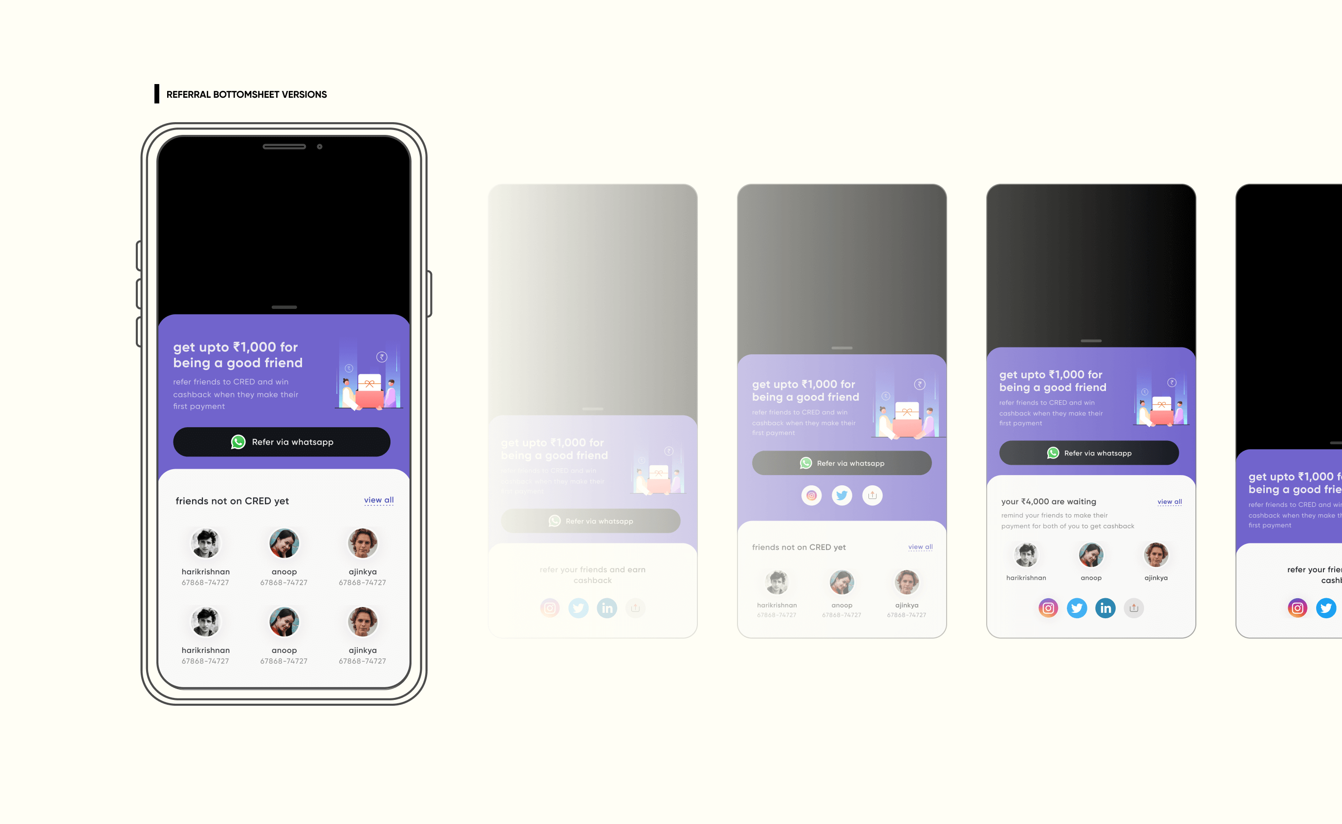
Simplifying the referral bottom sheet, which had become overly complicated with too many options presented upfront.
Emphasizing repeat referrals by not only boosting the key metric of acquiring new referrals but also optimizing for repeat referrers through gamification, exclusive campaigns, and streak rewards.
Enhancing upstream discovery to increase visibility and accessibility of the referral program within the app.
The team made a strategic decision to gamify the referral process, betting that transforming referrals into a fun and engaging experience would boost repeat referrals and strengthen the invite funnel. By introducing game-like elements, they aimed to enhance user interaction and participation.
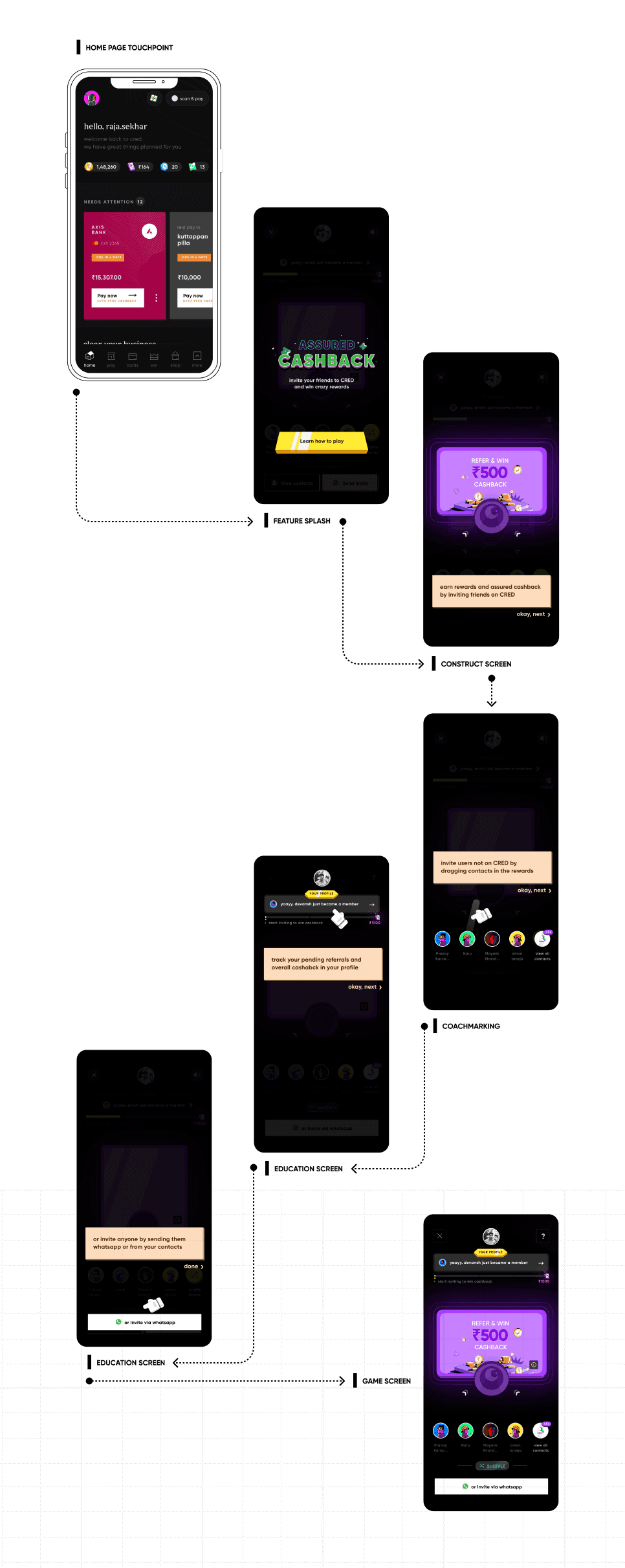
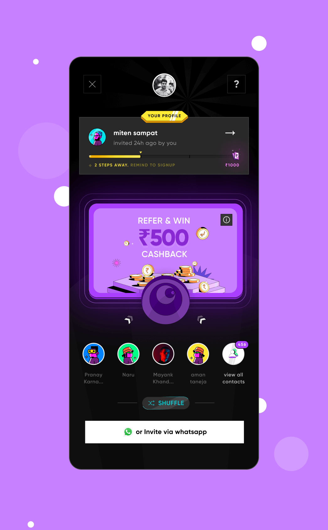
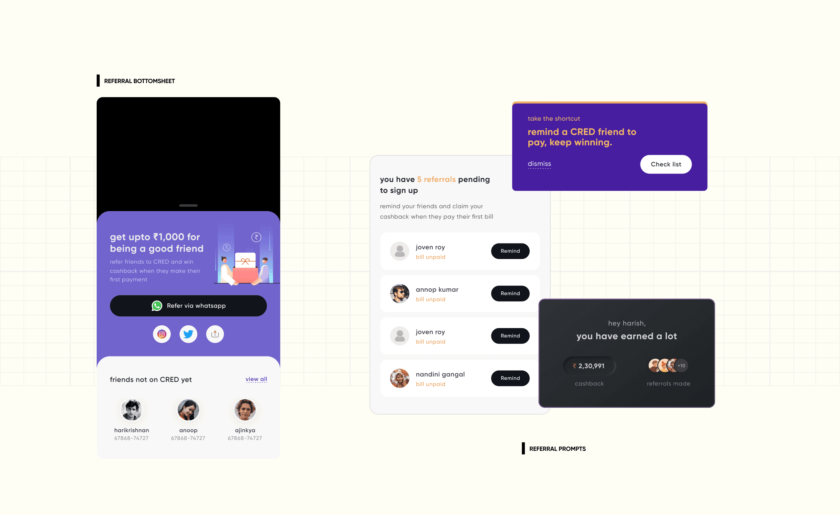
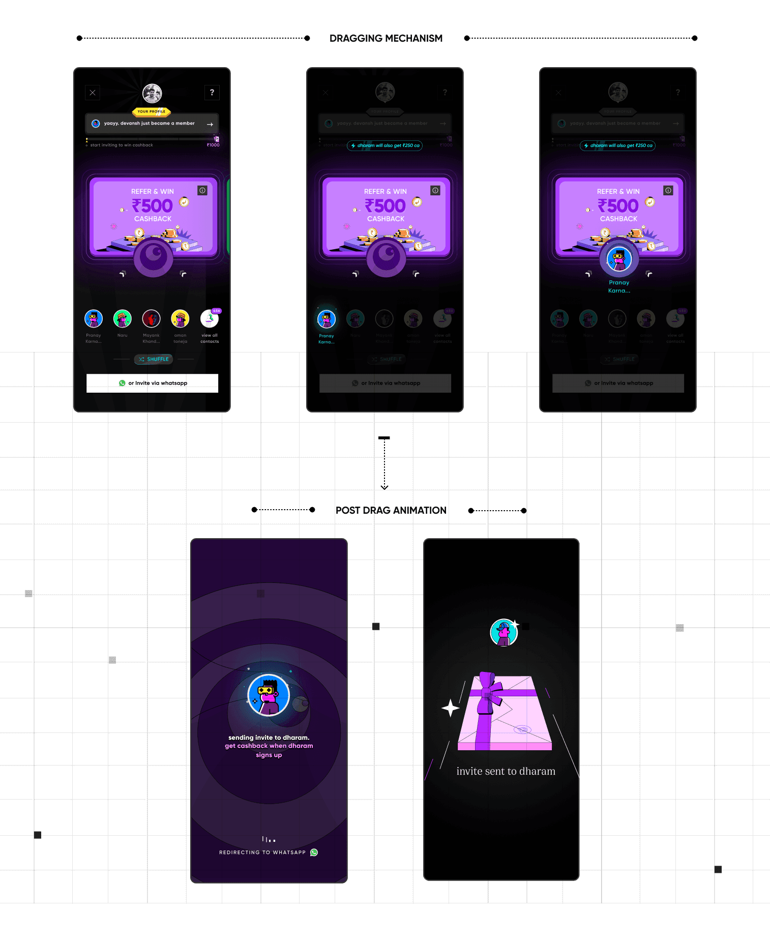
REVAMP : A BOLD APPROACH
Simplifying social sharing
The referral game featured a streamlined drag-and-drop mechanism. Users were presented with five contacts, which they could either drag into the interaction area or shuffle through. Upon dragging a contact, the system automatically drafted and animated the sending of a custom invitation, making the process both engaging and simple.
This revamp led to a high increase in first-time referrals and repeat referrals. It also helped the team understand better what parts of gamifying a referral experience works best for CRED members. User flow analysis and enhancements in the game mechanics continued to optimize funnels that were of key importance.

ONE OF THE SOLUTIONS
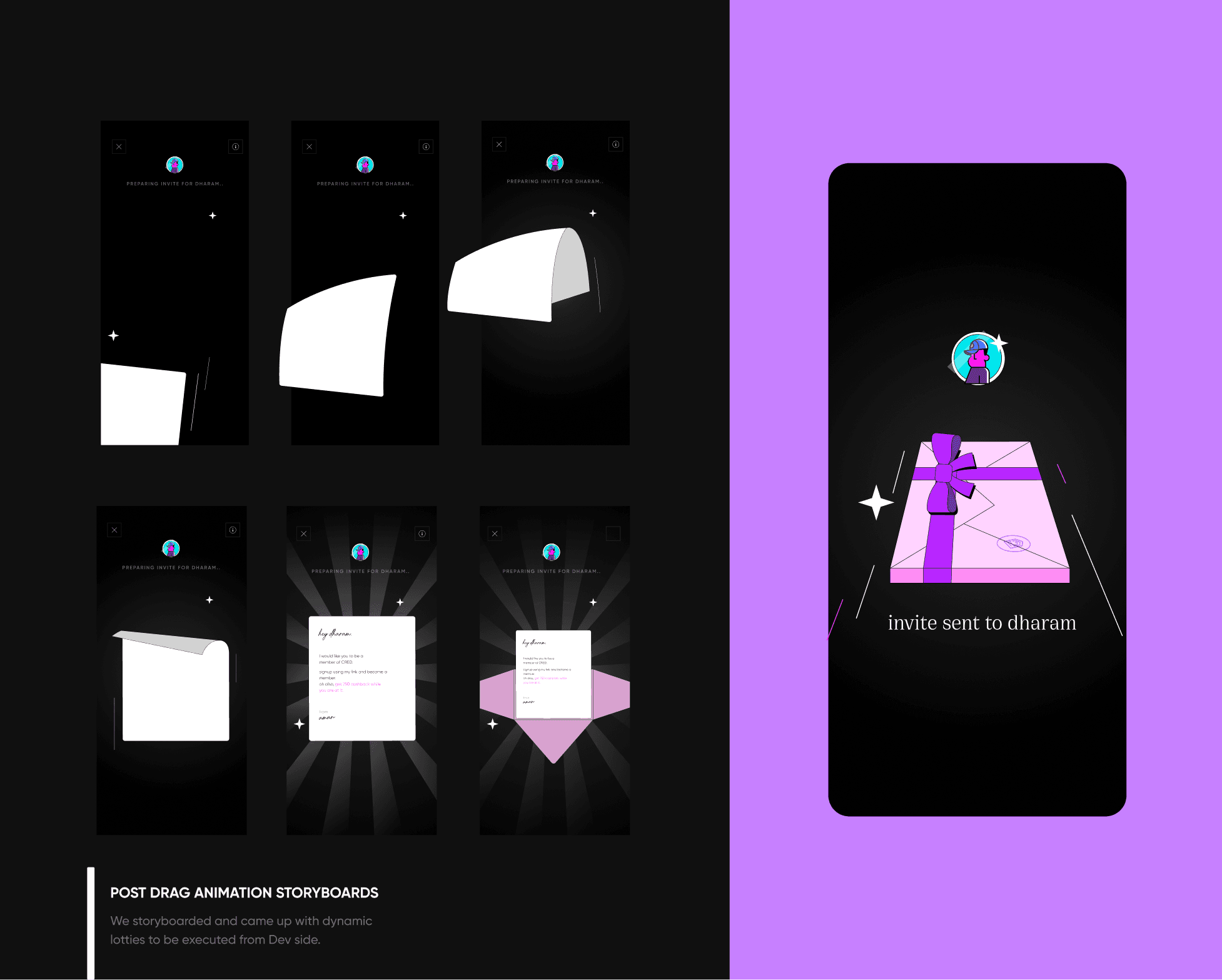
motion with meaning
One key focus area was reimagining animations within the flow. The team reevaluated the pacing and visual style of the Lottie animations, enhancing the experience with tactiles and sound effects.
This attention to animation details supports the overall narrative approach—making the onboarding feel like a thoughtful conversation between the brand and new members rather than just a functional process.
OBSERVED IMPACT
Measurable growth results
The redesigned referral system delivered significant results for CRED:
Increased first-time referrals through simplified user flows and engaging interactions
Boosted repeat referrals through gamification elements and streak rewards
Enhanced visibility of the referral program throughout the app experience
Improved user engagement with referral features through the dedicated dashboard
Created a scalable system that could be easily updated and optimized without app updates
FOOTNOTE : Social dimensions of growth
⚘
Throughout this project, I learned that excessive options end up overwhelming users and that designing for growth involves crafting creative campaigns and reward structures just as much as it depends on experience design.
I discovered that while the product provides foundational support, incorporating a social dimension within the app is crucial to stimulate growth without heavily relying on financial expenditures.
view next project

CRED : managing india's credit cards
the credit card buisness and product line for the 1% of india
referral
CRED's referral system is the growth strategy's cornerstone. Extremely dynamic and complex, enabling simultaneous experimentation across user segments, optimizing communication-reward controls
ROLE / SR. PRODUCT DESIGNER
UI DESIGN / UX DESIGN / PRODUCT STRATEGY
Starting as an intern in 2020, I evolved to co-lead referral , helping scale the platform through design changes and campaign narratives.